No, it’s not another of those programmes like When Stunts Go Bad, but based on the efforts of the branding and web department at or working for Be Broadband, you could start work on such a programme.
Before I start, granted, my site isn’t exactly a masterpiece of design/marketing/branding, but then I don’t employ people who do these things as their job.
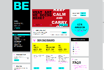
Having decided to visit the site and see what was new on the ISP’s forum yesterday, I was greeted with this:
A hideous site, you might say. It looks as though someone wanted an 80’s theme with the neon colours and a dodgy typewriter font but failed to pull off any sort of consistency. The whole page is of high contrast, too many fonts and colours with no clarity or flow, resulting in the eye wandering around. It takes me back to what the web looked like in the mid-90s, which is no good thing.
I wanted to sign in to the forum so the first place I looked was in the black panel on the left that looked like a menu, alas there was nothing there, so I had to scan around a bit more and there it was, in the top right corner in a box looking nothing like the navigation on the left that I was now expecting.
A box at the top of the page was rotating banners with what seemed useless/irrelevant information, a cyan circle, matching the plain fonted Be logo, houses an offer. A garish yellow highlights the three price points Be offers for its broadband and then the trademark pink which Be is probably known by, is demoted from use in the logo to text links.
Over on the Be forums there is a poll, to see it you need to sign up and sign in,the question asked:

As you can see, the site is a big hit (sarcasm). Either this is a viral marketing campaign to get Be’s name out to the public which has done so, but made the brand look shabby,or is a genuine re-branding exercise. In its current form the site may put of potential customers by making them think the site has been hacked, the company is unprofessional or isn’t a genuine ISP but a referral site. This could be seen as a good and bad thing for existing customers, with new custom being pushed away, existing customers who may be experiencing congestion could do without the extra load. On the other hand no new customers means that much less investment into the existing infrastructure. As a Be customer, I don’t mind what they do as long as the connection I have remains stable. It would be nice if they had a more professional/corporate looking site, rather than something to appeal to MySpace users, haven’t they heard, everyone is on Facebook and Twitter? 😛
Be are accepting feedback and if you wish to contact them to let them know what could be done to improve the site or anything else, you can contact them by email: whatwethink /at/ bethere.co.uk replace /at/ with @ If anyone at Be would like me to look at any re-designs to say yay or nay, then let me know I’m in the market for a job!
